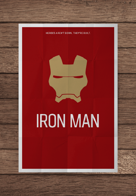
But actually, a movie poster can be extremely simple. Recently I found a very interesting series of poster designs made by a designer from Brazil named Pedro Vidotto. He did the posters with only extremely simple colors, 2D graphics and tag lines but which really speak for the movies. They remind me that a good design is not necessarily be complicated or difficult.
They put a smile on my face. What about you?


沒有留言:
張貼留言